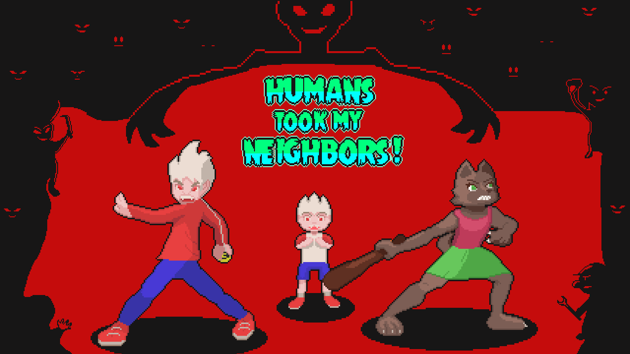
HTMN Devlog #2
Hi everyone, so today I’ll talk a little bit about what I’m working on this week.
Visuals are an important part of games as it’s basically the presentation card for your game you can have the most revolutionary game idea but if you don’t have something nice to look at you won’t grasp anyone’s attention long enough to show it, also inversely you can have a soso game with nice visuals and it’s more appealing than the competition (Fortnite vs Pubg comes to mind)
Well so basically I’ve been sprucing up the visuals to make them either stand out more or at least be more eye catching.
Here are the old visuals
Some of the objects you can collide with didn’t have an outline and I think this can be important as to differentiate the interactable object with the non interactable, aslo the color of the grass was a little bit too bright as we are in Monsternett I wanted to convey eerier vibe with the colors.
I changed the grass hedges with more detail as they were simply grass blocks and made grass a little bluer to show a bigger contrast also changed the moving grass when in the past it was simple grass strands now is a tall grass patch which sways with the wind also minor alterations to the trees I think it all adds up and little by little the game starts to change visually.
Another thing I added was some enemy variations. The main grunts now come in 3 variations instead of the standard blue one (maybe I'll add a couple more).
Well thank you for reading if you like what you got please follow me on Twitteror join our Newsletter.
Humans Took My Neighbors!
Save your neighbors from the human invasion
| Status | In development |
| Author | CarlosMakesGames |
| Genre | Action |
| Tags | 2D, Horror, Monsters, Pixel Art, Top-Down, zombiesatemyneighbors |
| Languages | English, Spanish; Latin America |
More posts
- HTMN Devlog #8 Giant baby!Feb 12, 2021
- Fixes and Tweaks to extended DemoFeb 05, 2021
- Kickstarter Extended Demo!Feb 03, 2021
- HTMN Extended Demo for Streamers!Jan 30, 2021
- HTMN Kickstarter is Live!Jan 26, 2021
- Unintrusive tutorial added!Jan 18, 2021
- Combat Update!Jan 17, 2021
- HTMN Devlog #5Jan 17, 2021
- HTMN Kickstarter and Demo!Jan 13, 2021
- HTMN Devlog #4Oct 01, 2020

Leave a comment
Log in with itch.io to leave a comment.